

CSS is one of the three core technologies of the web alongside HTML and JavaScript and controls how web pages look and feel. In the 2025 Stack Overflow Developer Survey, HTML and CSS appear among the most used technologies worldwide, with CSS used by more than 60 percent of respondents.
At the same time, the US Bureau of Labor Statistics projects web developer and digital designer roles to grow 7 percent from 2024 to 2034, which is faster than the average for all occupations.
So getting comfortable with common css interview questions is a smart move if you want to enter front end development.
The questions below are written so that you can almost read them out in an interview with minimal changes.
CSS stands for Cascading Style Sheets. It is a style sheet language used to describe how HTML or XML content should look in the browser, including layout, colors, fonts and spacing. It helps separate structure from presentation so that design can be changed without touching the HTML.
There are three ways.
The CSS box model represents every element as a box made of four parts. At the center is the content, around it is padding, then the border, and finally the outer margin. When I calculate element size I always consider content width plus padding plus border, while margin controls the gap to other elements.
A class selector targets elements using the class attribute and starts with a dot, for example .btn. It can be reused on many elements. An ID selector targets a unique element using the id attribute and starts with a hash, for example #header. IDs are meant to be unique and have higher specificity than classes.
Specificity is the rule CSS uses to decide which style wins when more than one rule targets the same element. Inline styles are strongest, then ID selectors, then class and attribute selectors, and finally type selectors. When specificity is the same, the rule that appears later in the stylesheet wins.
Block elements start on a new line and take the full available width by default, like <div> or <p>. Inline elements stay in the same line and take only the width of their content, like <span> or <a>. Inline block elements behave like inline elements in the flow but allow us to set width and height like a block.
A CSS selector is the part of a rule that tells the browser which elements to style. It can select elements by tag name, class, ID, attributes, state or position in the DOM tree. For example, p, .btn-primary, #header, input[type='text'] and a:hover are all different selectors.

A pseudo class represents a special state of an element, like :hover, :focus, :active or :first-child. A pseudo element targets a part of an element or creates a virtual element, like ::before, ::after, ::first-line or ::first-letter. I use pseudo classes for interaction states and pseudo elements for decorative content.
Browsers apply their own default styles to elements. A CSS reset or normalize stylesheet removes or standardizes those defaults so that styles behave consistently across browsers. In interviews I usually say that I use a reset or normalize.css at the start of most projects to avoid cross browser surprises.
I combine fluid layouts, relative units and media queries. First I use percentages or flex and grid so the layout can stretch. Then I use rem or viewport based units for typography. Finally I add media queries to adjust layout or font sizes at key breakpoints for mobile, tablet and desktop.
A media query lets CSS apply styles only when certain conditions are true, such as max-width: 768px for small screens. The basic syntax is @media (condition) { rules }. Media queries are the foundation of responsive design because they let the layout adapt to different devices and screen sizes.
display: none removes the element from the layout completely so it takes no space. visibility: hidden keeps the element in the layout but makes it invisible. I use display: none when something should not affect layout at all, and visibility: hidden when I want to preserve the space.
static is the default and follows normal flow.
relative keeps the element in flow but allows offset from its normal position.
absolute removes the element from flow and positions it relative to the nearest positioned ancestor.
fixed attaches the element to the viewport.
sticky behaves like relative until a scroll threshold then sticks.
The modern way is to use Flexbox on the parent container:
.parent {
display: flex;
justify-content: center;
align-items: center;
}
This centers the child both horizontally and vertically without knowing its size. Alternatively, I can use Grid with place-items: center.
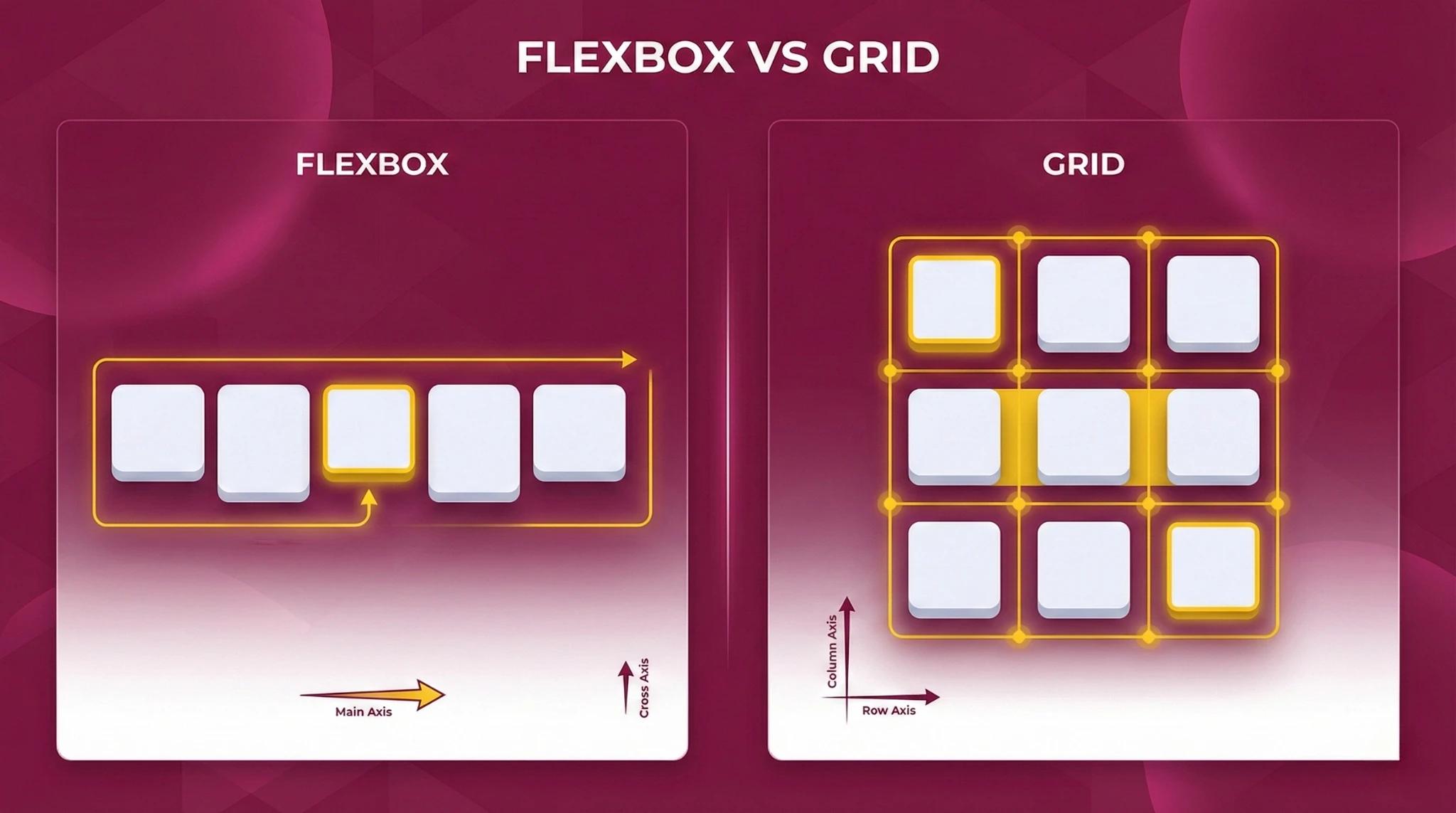
Flexbox is a one dimensional layout system for arranging items in a row or column. It makes it easy to space, align and reorder items without using floats or complex margins. I use Flexbox for navbars, toolbars, cards in a row and any component where the main concern is distributing items along one axis.
CSS Grid is a two dimensional layout system that lets you define rows and columns and place elements into a grid. Flexbox handles layout in one direction at a time. I use Grid for full page or section layouts and Flexbox for individual components inside those grid areas.

I usually set images to max-width: 100% and height: auto so they scale with the container. For background images I use background-size: cover and background-position: center. When performance matters I combine these techniques with HTML attributes like srcset and sizes so browsers can pick appropriate image resolutions.
box-sizing: border-box changes how width and height are calculated. The declared width includes content, padding and border. This makes layout calculations much easier because adding padding or border does not increase the overall size of the element. Many developers apply it to all elements using a global reset.
!important raises the priority of a CSS declaration so that it overrides other rules that would normally win through specificity. I avoid it in regular styling and only use it as a last resort, for example when I need to override third party library styles that I cannot change directly.
CSS variables, also called custom properties, let us store values in reusable variables. We define them inside a selector with --name and use them with var(--name). For example:
:root {
--primary-color: #0066ff;
}
button {
background: var(--primary-color);
}
They support theming and dynamic changes with JavaScript.
First I use browser dev tools to inspect elements, check which rules are applied and see the box model. I toggle and edit properties live to narrow down the problem, then check specificity, inheritance and cascade order. I also check for caching issues and test in more than one browser when it looks like a rendering bug.
A CSS preprocessor like Sass or Less is a tool that lets you write CSS with extra features such as variables, nesting, mixins and functions, and then compiles it to normal CSS. It improves maintainability in larger projects by reducing repetition and allowing more structured stylesheets.
I minimize and combine CSS files to reduce requests, avoid large unused frameworks, and load critical CSS inline for faster first paint. I use modern layout features like Flexbox and Grid instead of heavy images, and I remove unused styles regularly. Good CSS helps performance because cleaner code means less work for the browser.
