







Table of Contents
- 1.
- 2.
- 3.
- 4.
- 4.1
- 5.
- 6.
- 7.
- 8.
- 8.1
Introduction
A true CEO-level dashboard in Power BI is not about visual complexity; it is about strategic clarity. CEOs do not want operational noise. They want high-impact metrics that answer one question quickly: Are we winning or losing?
Unlike team-level dashboards that focus on daily tasks and detailed breakdowns, executive dashboards prioritize growth trends, risk indicators, financial health, and forward-looking insights. Every visual must justify its existence. Every KPI must connect directly to business performance.
When designed correctly, a CEO-level dashboard becomes a decision engine, not a reporting screen.
In this step-by-step guide, we’ll break down how to define the right KPIs, structure your data model, design for executive clarity, and build a Power BI dashboard that leaders actually use.
What Makes a CEO-Level Dashboard Different?
Not all dashboards are created equal.
An operational dashboard helps teams manage daily activities. A CEO-level dashboard helps leaders make strategic decisions.
The difference lies in focus, depth, and presentation.
An executive dashboard is built around outcomes, not activity. It answers high-level questions such as the following:
- Are we growing profitably?
- Where are we losing money?
- What risks are emerging?
- How does performance compare to targets?
Unlike detailed departmental dashboards, a CEO-level dashboard in Power BI eliminates clutter and highlights only business-critical metrics.
According to best practices for building an executive dashboard in Power BI, clarity and strategic alignment are more important than visual complexity.
Here’s what sets executive dashboards apart:
- Fewer but high-impact KPIs
- Strong trend visibility over time
- Clear performance indicators (green, amber, red)
- Minimal scrolling and filtering
- Action-oriented layout
A CEO should understand the dashboard within seconds. If interpretation requires explanation, the design needs refinement.
The goal is not to impress with visuals; it is to enable faster, smarter decisions. Next, let’s define the strategic KPIs before even opening Power BI.
Step 1: Define Strategic KPIs Before Opening Power BI
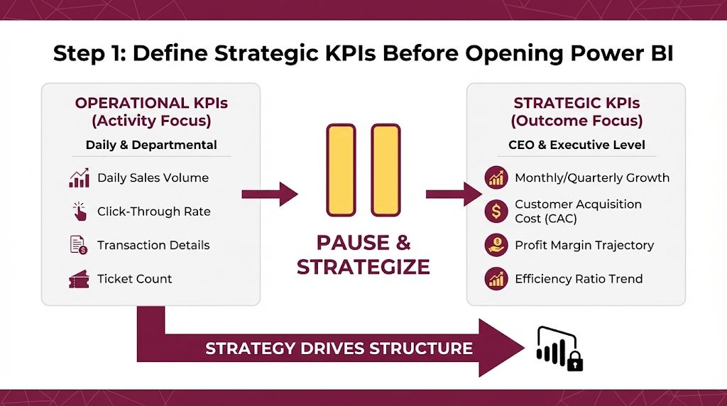
The biggest mistake analysts make is starting with visuals instead of strategy. A CEO-level dashboard in Power BI must begin with the right questions, not the right charts.
Executive dashboards revolve around performance drivers. That means selecting KPIs that directly reflect business health, growth, and risk.
Common strategic KPIs include:
- Revenue growth rate
- Gross and net profit margin
- Cash flow trend
- Customer acquisition cost (CAC)
- Customer lifetime value (CLV)
- Forecast vs actual performance
- Burn rate or cost ratio
These metrics should answer: Are we scaling? Are we profitable? Are we sustainable?
Operational KPI vs Executive KPI
| KPI Type | Operational Dashboard | CEO Level dashboard |
|---|---|---|
| Revenue | Daily sales volume | Monthly/quarterly growth |
| Marketing | Click-through rate | Customer acquisition cost |
| Finance | Transaction details | Profit margin trajectory |
| Operation | Ticket count | Efficiency ratio trend |
Notice the shift: operational dashboards focus on activity, while executive dashboards focus on outcomes.
You should only move to design after defining these KPIs. Strategy drives structure, not the other way around.
Next, we’ll structure the data model correctly for executive reporting.
Step 2: Structure the Data Model for Executive Reporting
A CEO-level dashboard in Power BI is only as strong as its data model.
You can design the most elegant visuals, but if your data relationships are weak or inconsistent, the dashboard loses credibility instantly.
Executive reporting demands clean aggregation, accurate time comparisons, and reliable KPI calculations.
Start with these foundations:
1. Clean & Consolidate Data Sources
Executive dashboards often pull data from:
- Sales systems
- Financial databases
- CRM platforms
- Marketing tools
Before modeling, ensure:
- No duplicate records
- Consistent date formats
- Standardized naming conventions
- Clear primary keys
2. Build Proper Relationships
Use a star schema structure where possible:
- Fact tables (transactions, revenue, expenses)
- Dimension tables (date, product, region, customer)
This structure improves performance and keeps KPI calculations accurate.
When learning how to build a KPI dashboard with Power BI, one consistent recommendation is maintaining clean data relationships to avoid misleading results.
3. Implement Time Intelligence
CEOs care about trends.
Your data model must support:
- Month-over-month growth
- Year-over-year comparison
- Rolling averages
- Forecast alignment
Use DAX measures carefully. Avoid calculated columns for dynamic KPIs when measures are more efficient.
4. Optimize for Performance
Executive dashboards must load fast.
- Reduce unnecessary columns
- Disable auto date/time if not required
- Optimize DAX formulas
- Avoid overly complex visuals
When the data model is structured properly, your visuals become strategic tools, not decorative charts.
Now that the foundation is set, it’s time to design with clarity.
Build Dashboards That Decision-Makers Trust
Building a CEO-level dashboard in Power BI requires more than technical skills. It demands strategic thinking, business alignment, and structured execution.
If you want to design dashboards that go beyond charts and truly support decision-makers, follow an industry-aligned BI learning path that focuses on real-world business scenarios, not just tool tutorials.
Strong dashboards are built when you understand:
- How executives interpret KPIs
- How to translate raw data into business narratives
- How to design for clarity under pressure
- How to validate metrics before presentation
When your dashboards reflect strategy instead of just structure, they gain trust.
Master the fundamentals. Align with business goals. Then design.
Step 3: Design for Clarity, Not Complexity
At the executive level, design is not decoration; it is communication.
A CEO-level dashboard in Power BI must prioritize clarity over visual creativity. The goal is not to showcase every available chart type. The goal is to make performance instantly understandable.
Start with structure.
1. Place Critical KPIs at the Top
Your top row should contain
- Revenue
- Profit margin
- Growth percentage
- Cash position
These KPIs act as executive anchors. Everything else supports them.
2. Use Visual Hierarchy Intentionally
Hierarchy determines attention.
- Larger visuals → more important metrics
- Consistent colors → faster interpretation
- Adequate white space → reduced cognitive load
Avoid overcrowding the canvas. If you need scrolling, redesign.
The 5-Second Rule for Executive Dashboards
If a CEO cannot understand the dashboard in 5 seconds, it is too complex.
Apply this rule:
- Remove unnecessary filters
- Avoid raw data tables
- Replace multiple charts with summary visual
- Use conditional formatting (green = good, red = risk)
The purpose is instant insight, not analytical exploration.
Visual Element vs Executive Impact
| Visual element | When to use | CEO benefit |
|---|---|---|
| KPI Cards | High-level metrics | Immediate clarity |
| Line charts | Trend analysis | Growth visibility |
| Bar charts | Category | Performance |
| Conditional colors | Threshold alerts | Faster decision making |
Minimal design does not mean less information. It means better prioritization.
Next, let’s elevate the dashboard with forecasting and scenario insights.
Step 4: Integrate Forecasting for Strategic Decision-Making
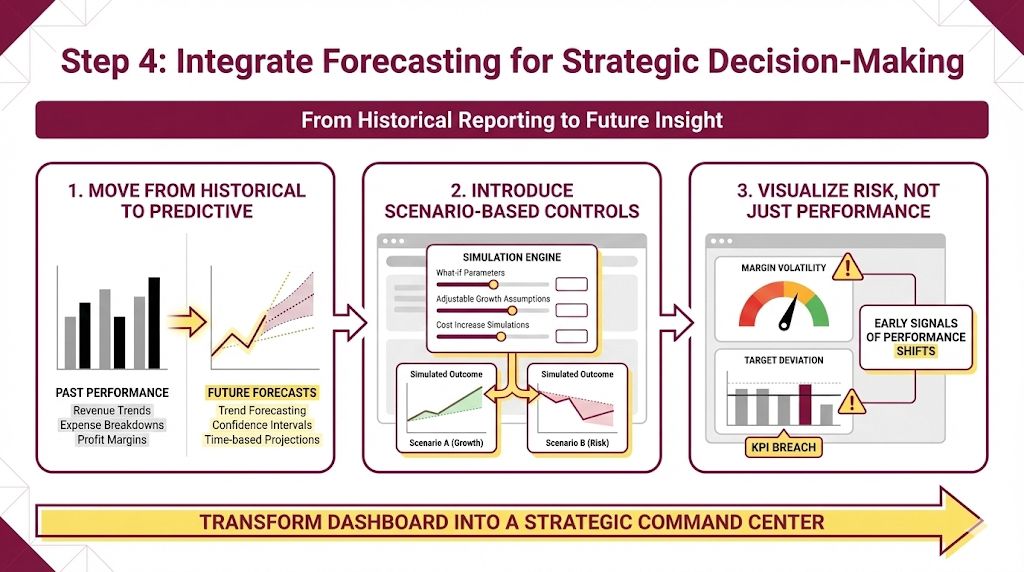
A CEO-level dashboard in Power BI should not stop at historical reporting. It must extend into forward-looking insight. Executives are less concerned with what happened last month; they want clarity on what happens next.
Move from Historical to Predictive
Most dashboards show past performance:
- Revenue trends
- Expense breakdowns
- Profit margins
But strategic leaders operate in the future. Adding forecasting layers helps shift the dashboard from descriptive to predictive.
Power BI allows you to add:
- Trend forecasting
- Confidence intervals
- Time-based growth projections
When applied correctly, these visuals provide early signals of performance shifts. Structured approaches outlined in a Power BI dashboard tutorial highlight how predictive visuals should enhance clarity, not clutter the dashboard.
Introduce Scenario-Based Controls
Executive dashboards become powerful when they allow interaction.
Instead of static reporting, integrate:
- What-if parameters
- Adjustable growth assumptions
- Cost increase simulations
- Revenue sensitivity analysis
These elements transform the dashboard into a decision-support tool. Leadership can test outcomes before making commitments.
Visualize Risk, Not Just Performance
Strategic dashboards must expose risk clearly.
Consider adding:
- Margin volatility indicators
- Deviation from targets
- Forecast variance tracking
- Conditional alerts for KPI breaches
A dashboard that only celebrates success is incomplete. A CEO-level dashboard highlights potential problems early.
When forecasting and scenario insights are built with discipline, the dashboard evolves from a reporting interface into a strategic command center.
This structure is cleaner, executive-aligned, and varied from previous sections.
Step 5: Validate with Business Context
A dashboard may look perfect technically but if it does not align with how the business actually operates, it fails at the executive level.
Before presenting your CEO-level dashboard in Power BI, validation is critical.
Review KPI Relevance
Not every metric deserves executive attention.
Ask:
- Does this KPI influence strategic decisions?
- Is this metric tied to revenue, profitability, or risk?
- Would leadership take action based on this number?
If the answer is no, remove it. Executive dashboards reward precision not volume.
Test the Narrative Flow
An effective dashboard tells a logical story.
For example:
Revenue growth → Margin impact → Cost trend → Forecast risk
The layout should guide the viewer naturally from performance to implication.
Avoid jumping between unrelated visuals. Structure must mirror decision logic.
Validate Data Accuracy
Trust is everything at the executive level.
Before final deployment:
- Cross-check totals with finance reports
- Verify time comparisons
- Confirm forecast assumptions
- Review aggregation logic
A single inaccurate KPI can damage credibility instantly.
Seek Stakeholder Feedback
A CEO-level dashboard is not built in isolation.
Schedule a review with:
- Finance leaders
- Sales heads
- Strategy teams
Their feedback ensures that metrics reflect real operational priorities.
You can observe how structured validation contributes to stronger outcomes by reviewing verified placement outcomes from professionals who align technical dashboards with business strategy.
When validation is complete, your dashboard is no longer just technically sound; it becomes strategically trusted.
Conclusion
A CEO-level dashboard in Power BI is not about advanced visuals; it is about strategic clarity.
From defining the right KPIs to structuring a clean data model, designing for instant comprehension, and integrating forecasting insights, every step must align with executive decision-making. The goal is simple: help leadership act faster and with confidence.
When your dashboard:
- Focuses on business outcomes
- Highlights risk and growth clearly
- Supports scenario-based decisions
- Validates data accuracy
It becomes more than a reporting tool. It becomes a strategic asset.
Executives do not need more data.They need better visibility.
Build dashboards that simplify complexity, surface opportunity, and enable action and your Power BI skills will move from operational support to executive impact.
Master Executive-Level Power BI Dashboarding
Designing a CEO-level dashboard in Power BI requires more than technical knowledge. It demands strategic thinking, KPI clarity, and the ability to translate complex data into executive decisions.
If you want to build dashboards that go beyond visuals and truly support leadership teams, the Certification in AI-Powered Data Analytics helps you develop the exact skills required from strategic KPI selection to forecasting insights and executive-ready design.
Strong executive dashboards are built when you combine
- Data modeling fundamentals
- Forecasting and scenario simulations
- Business storytelling techniques
- Executive validation discipline
This is not just about tools; it’s about thinking like a decision-support partner.
Upgrade your dashboarding skills.Think like a strategist.Design like an executive advisor and watch leadership trust your insights