
Colors speak louder than words. Long before a visitor reads a line of text on your website, their mind has already formed an impression based purely on colors. As digital marketers and designers, understanding this silent yet powerful language of color is essential to shaping perception, driving engagement, and influencing buying decisions.
In the vast landscape of digital marketing, where every click counts, mastering color psychology can give your brand the competitive edge it needs. Let’s dive deep into how colors affect human emotions, the science behind their impact, and how top designers leverage this to create high-converting digital experiences.
Color psychology is the study of how colors influence human emotions and behaviors. In marketing and branding contexts, it explores how color choices can shape consumer impressions, trust, urgency, value perception, and overall response to a brand or product.
Studies show:
These findings demonstrate that color isn’t just decorative; it is a powerful, evidence-based marketing tool.

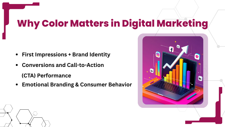
In digital spaces, websites, ads, and apps, consumers make decisions in seconds. The color palette you choose can define whether they stay, explore, or exit. Here’s why:
Color creates the first emotional connection between your brand and your audience. It communicates your brand’s values faster than any tagline ever could.
For example, consistent color usage helps people identify your brand almost instantly. Research shows brand recognition can improve by up to 80% with consistent and strategic use of color.
This is why major brands carefully choose signature colors so that even before reading the name/logo, a visitor subconsciously associates the color with their brand identity.
Color influences attention and action. A well-chosen CTA color, especially one that contrasts with the background, can draw eyes to it and prompt clicks. According to marketing literature, changing design/color elements in a web flow (including color) can meaningfully affect conversion rates.
However, there is no universal “best” color for CTAs; what works depends on context, background color, contrast, and the audience.
Consumers don’t buy products; they buy emotions. Color psychology helps marketers evoke specific feelings to align with brand personality and influence purchase decisions. For example:
Also, across various reports, many consumers note that color improves brand visibility and influences their buying decision.
Thus, the colors you choose do more than make your design look good; they shape how people feel about your brand and whether they take action.
Here’s a breakdown of common colors, what they tend to evoke, and how marketers commonly use them. The interpretations are based on widespread industry practices and academic/market research findings.
| Color | Typical Emotional / Psychological Associations | Common Uses in Marketing / Branding | ||||
|---|---|---|---|---|---|---|
| Red | Blue | Green | Yellow / Orange | Black / Dark tones | White / Light / Neutral | Purple |
| Energy, urgency, passion, excitement | Trust, reliability, calm, professionalism | Growth, health, balance, freshness | Optimism, energy, creativity, warmth | Sophistication, luxury, premium, authority | Simplicity, purity, cleanliness, minimalism | Creativity, luxury, mystery, uniqueness |
| Clearance sales, limited-time offers, CTA buttons, fast-action prompts | Finance, education, corporate, health, tech, anywhere, trust and stability matter | Eco-friendly or health products, finance, sustainability-oriented brands | Youth-oriented brands, promotions, creative agencies, and calls-to-action that need vibrancy | Luxury brands, premium services, tech products, minimalistic or elegant designs | Tech, wellness, modern/minimalistic design, readability emphasis | Beauty, luxury, creative industries, and brands seeking to appear unique or premium |
Important caveats: No color has a universally fixed meaning. Perception varies across culture, age, background, and context. What feels trustworthy and calming to one audience might feel bland to another.
Cultural & Contextual Nuances Color Is Not Universal
One of the most overlooked aspects of color psychology is cultural influence.
Therefore, when choosing colors especially for global or diverse audiences always consider cultural context, user demographics, and potential associations.

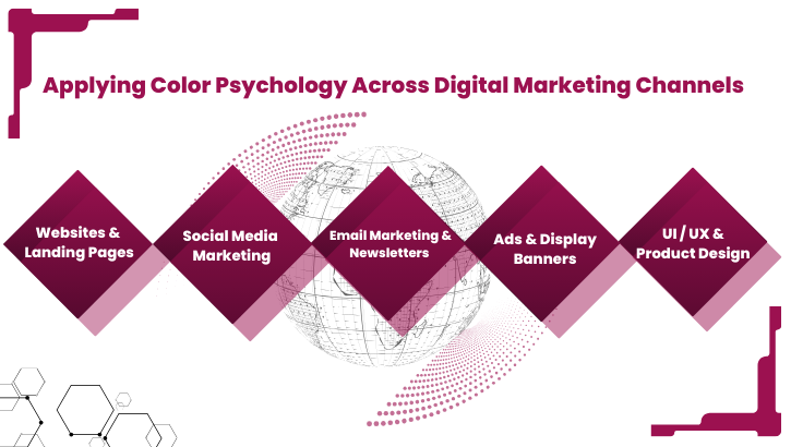
Different digital channels, websites, social media, email, ads have unique characteristics and user behavior. Applying color psychology effectively involves adapting to those differences:
Your website is the digital face of your brand. Use:
Designers often use the 60-30-10 rule: 60% dominant color, 30% secondary, 10% accent to maintain harmony and avoid overwhelming users.
Also, ensure contrast and accessibility, especially for text readability and for users with visual impairments.
Social platforms are fast-paced and attention-driven. Use vibrant, emotionally resonant colors for posts, stories, and ads.
Consistent brand colors across posts help build brand recall users begin recognizing your content even before reading captions.
Color matters even in email design, header colors, CTA buttons, sections, and backgrounds. Strategic use of color can influence open rates, click-through rates, and user engagement. For instance, a contrasting CTA button (bright color against a light background) tends to get more attention.
In ads and banners, where attention spans are brief, contrast and boldness matter the most. High-contrast combinations (e.g., light text on dark background, or vibrant accent against neutral base) catch eyes quickly.
Also, for e-commerce or product-based ads, color can subtly communicate value perception, warm colors implying urgency or affordability; cool/dark implying premium price.
In web/app UI, color hierarchy helps users navigate and understand priority active buttons vs disabled states, warnings vs success messages, hover effects, and interactive elements. Thoughtful use of color improves usability, accessibility, and reduces cognitive load.
It’s not just theory; empirical studies back up the impact of color in marketing:
These quantitative insights give you objective justification, not just design intuition, for carefully crafting color strategies.
Given the data and research, color should be considered a central element in marketing design not an afterthought.
1. Define Brand Personality & Emotion You Want to Evoke
Before selecting colors, ask: What emotion or value do you want users to associate with your brand? Is it trust, urgency, creativity, luxury, familiarity, or playfulness? Your color palette should reflect that core personality.
2. Use the 60-30-10 Rule for Balanced Design
Adopt this classic design principle:
This ensures balance and guides user attention where you want it.
3. Maintain Consistency Across Platforms
From website to social media to ads, using consistent colors helps in brand recall. Over time, people will subconsciously associate those colors with your brand, even before reading your name or logo.
4. Contextualize Color Choices: Know Your Audience & Culture
Don’t blindly apply global assumptions. Consider cultural context, user demographics, and regional color associations. A shade that feels joyful in one culture might feel negative in another. Always research your target market.
5. Use Data A/B Testing & Analytics
Don’t just rely on assumptions. Use A/B testing to try different color versions of CTAs, landing pages, email buttons, etc. Track conversion rate, click-through rate, bounce rate, dwell time and let real user data guide your final color decisions.
As a leading IT-training and placement institute (in Chennai), WHY TAP understands the value of first impressions. A well-designed website with appropriate color psychology can influence a prospective student’s decision even before they read any content.
By using color psychology principles, clear branding, contrasting CTA buttons, consistent palette, WHY TAP reinforces its brand identity and ensures its digital presence communicates exactly what it stands for: modern training + trust + opportunity.
If you are designing a landing page for a training institute, consultancy, or course, studying WHY TAP’s approach can be a valuable reference.
Here’s a ready-to-use checklist for applying color psychology and boosting your content’s credibility:
In digital marketing, color isn’t an afterthought; it’s a strategic decision. It defines brand personality, influences first impressions, builds trust or urgency, and drives action.
As seasoned designers and marketers know, the goal isn’t to pick your favorite colors; it’s to pick colors your customers will love and act upon. That’s the real artistry behind successful digital design.
By combining creative sensibility with data-driven insights, cultural awareness, and user psychology, you build not only beautiful interfaces but effective, high-converting, trustworthy digital experiences.
At institutions like WHY TAP, where design meets marketing and learning meets opportunity, color psychology isn’t just about aesthetics, but about shaping real outcomes.
So the next time you design a campaign, a logo, or a landing page, remember:
You’re not just coloring pixels. You’re painting emotions.